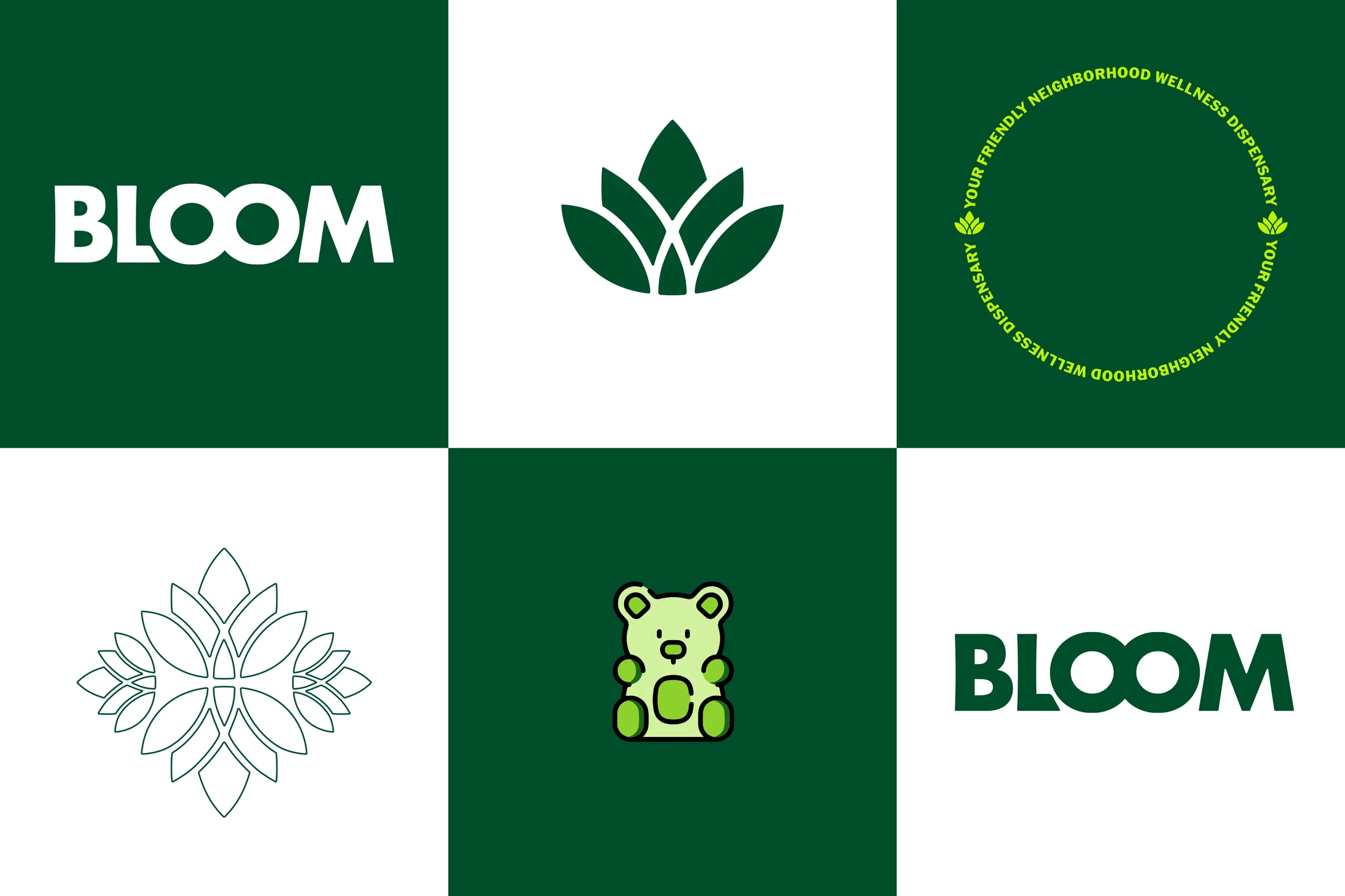
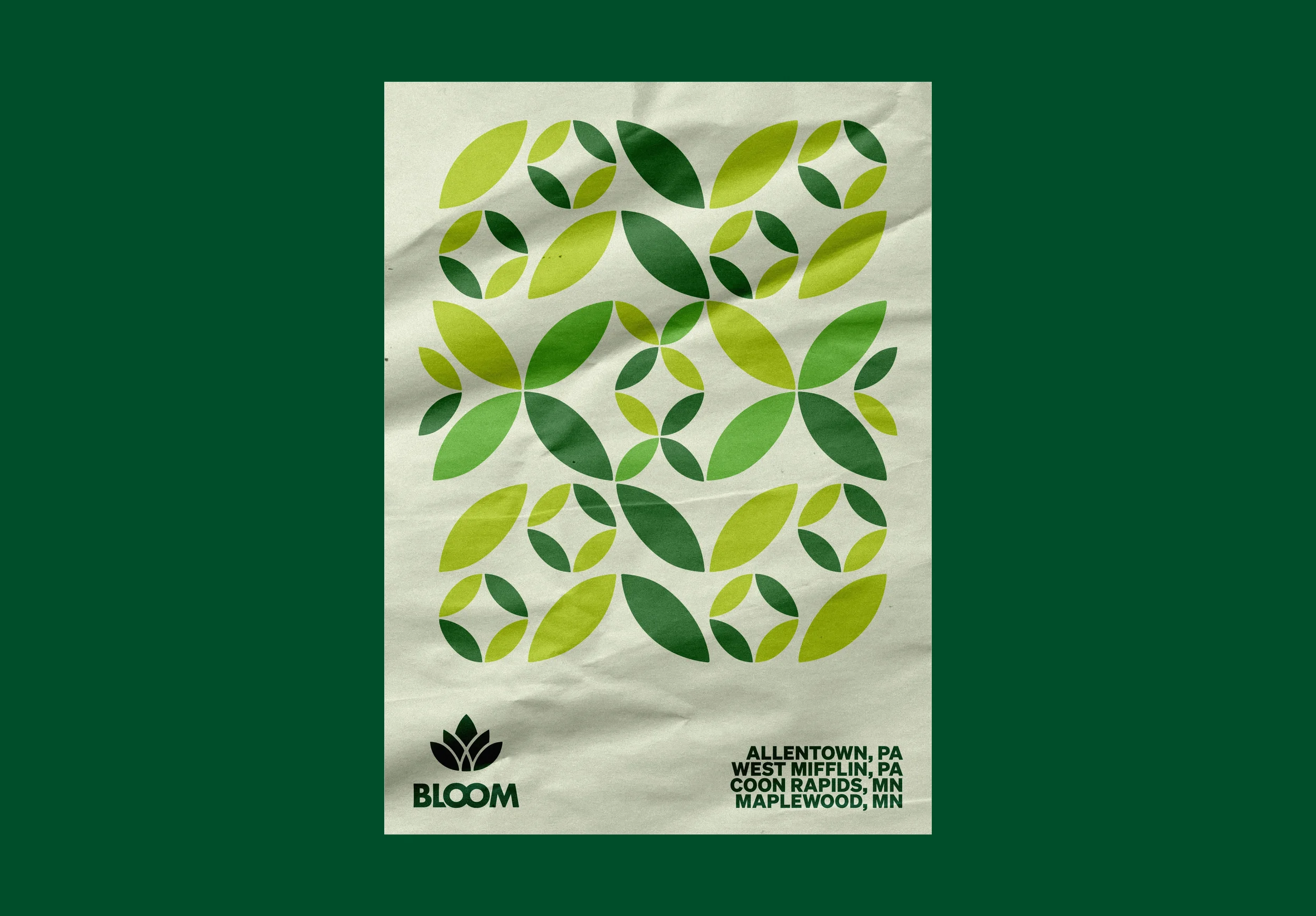
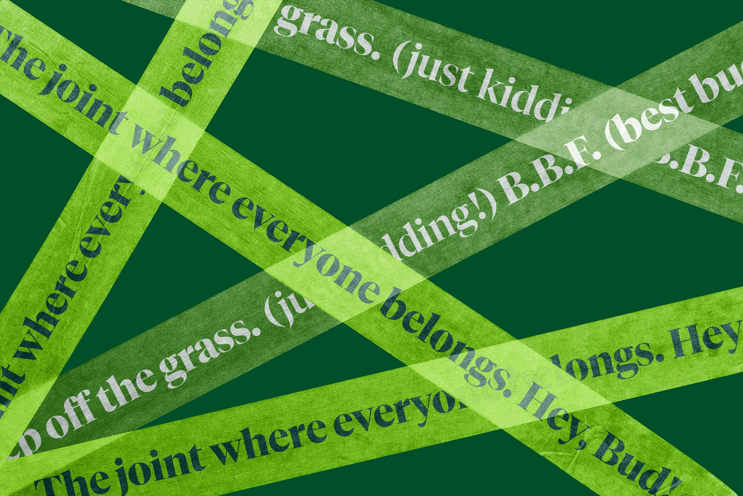
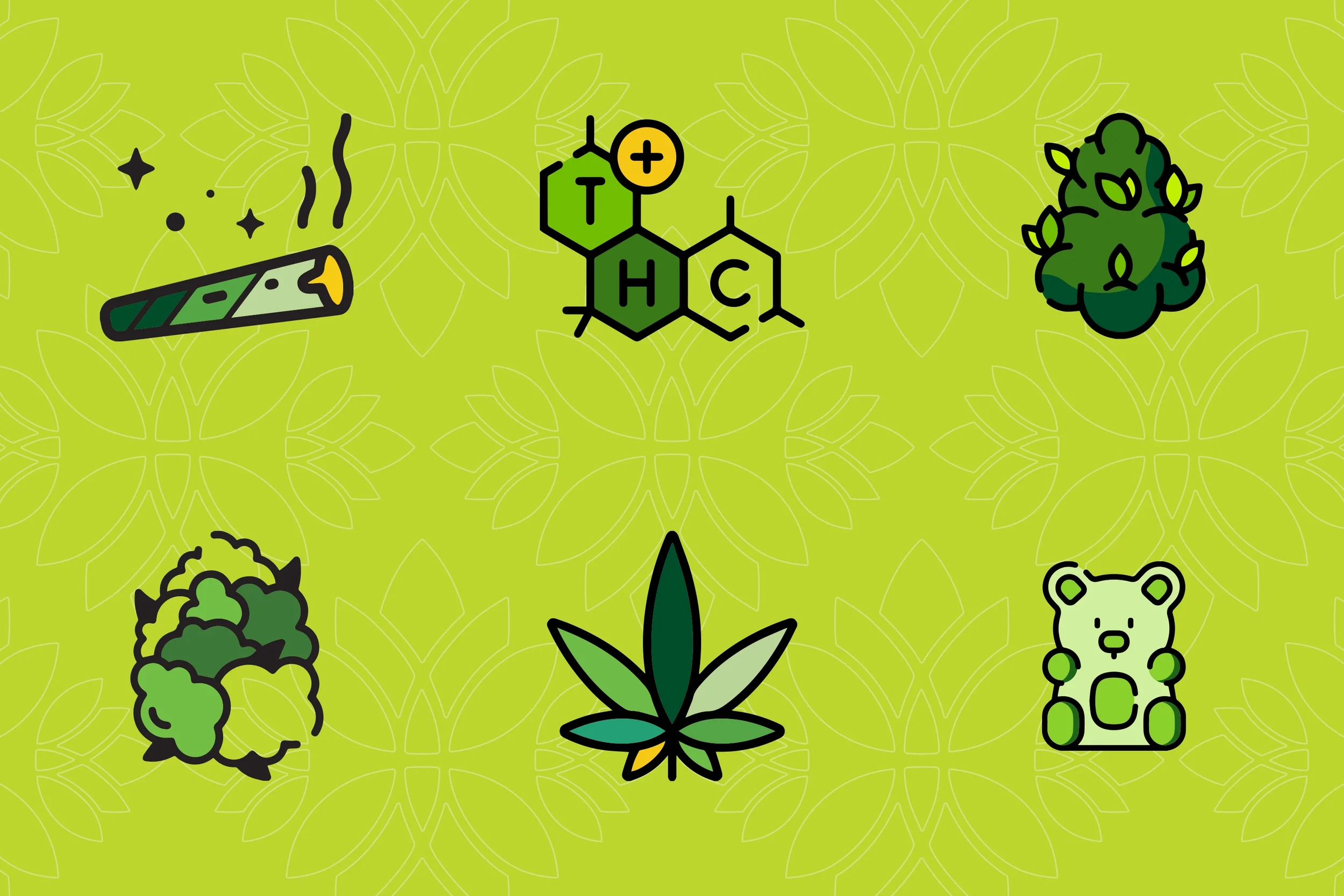
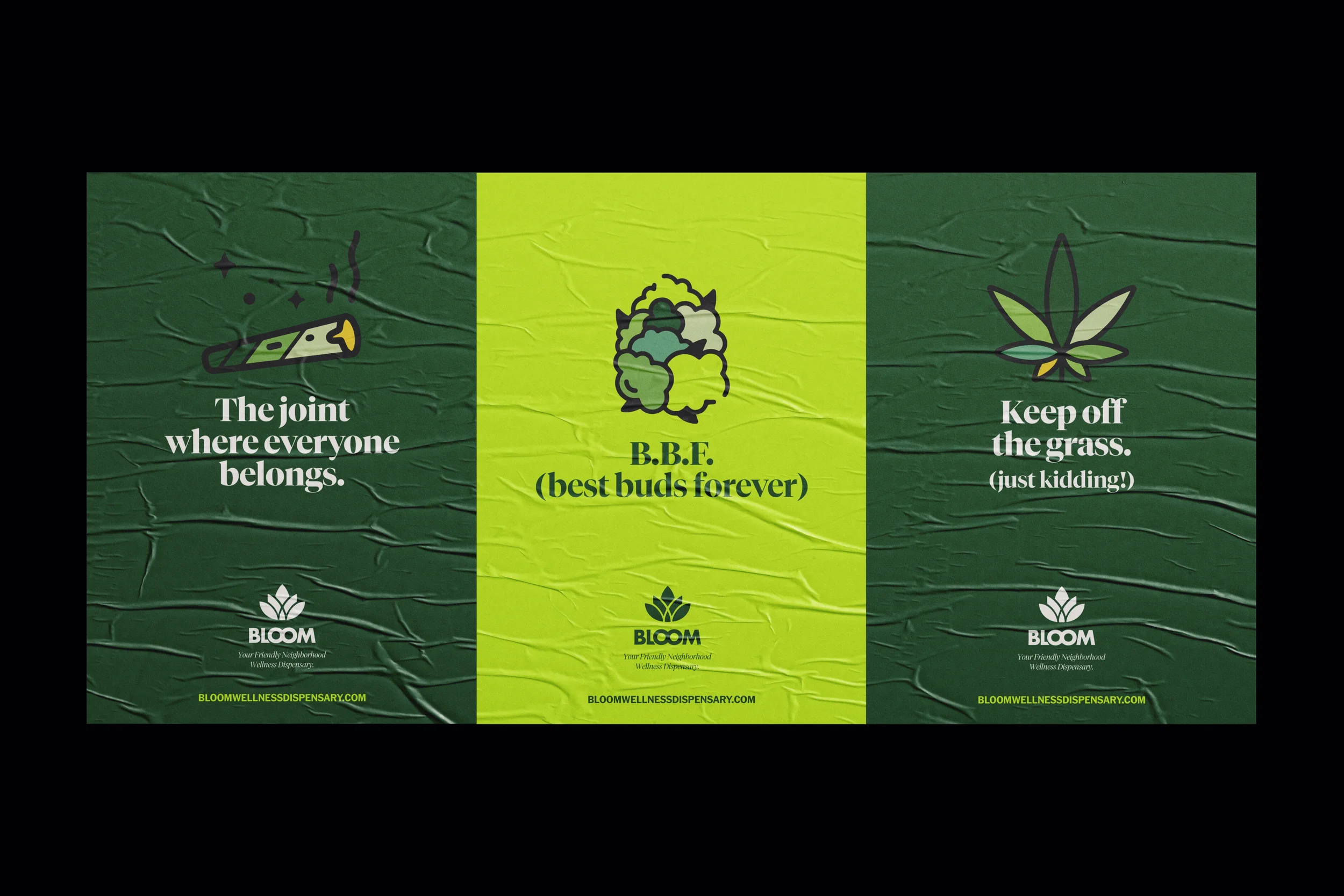
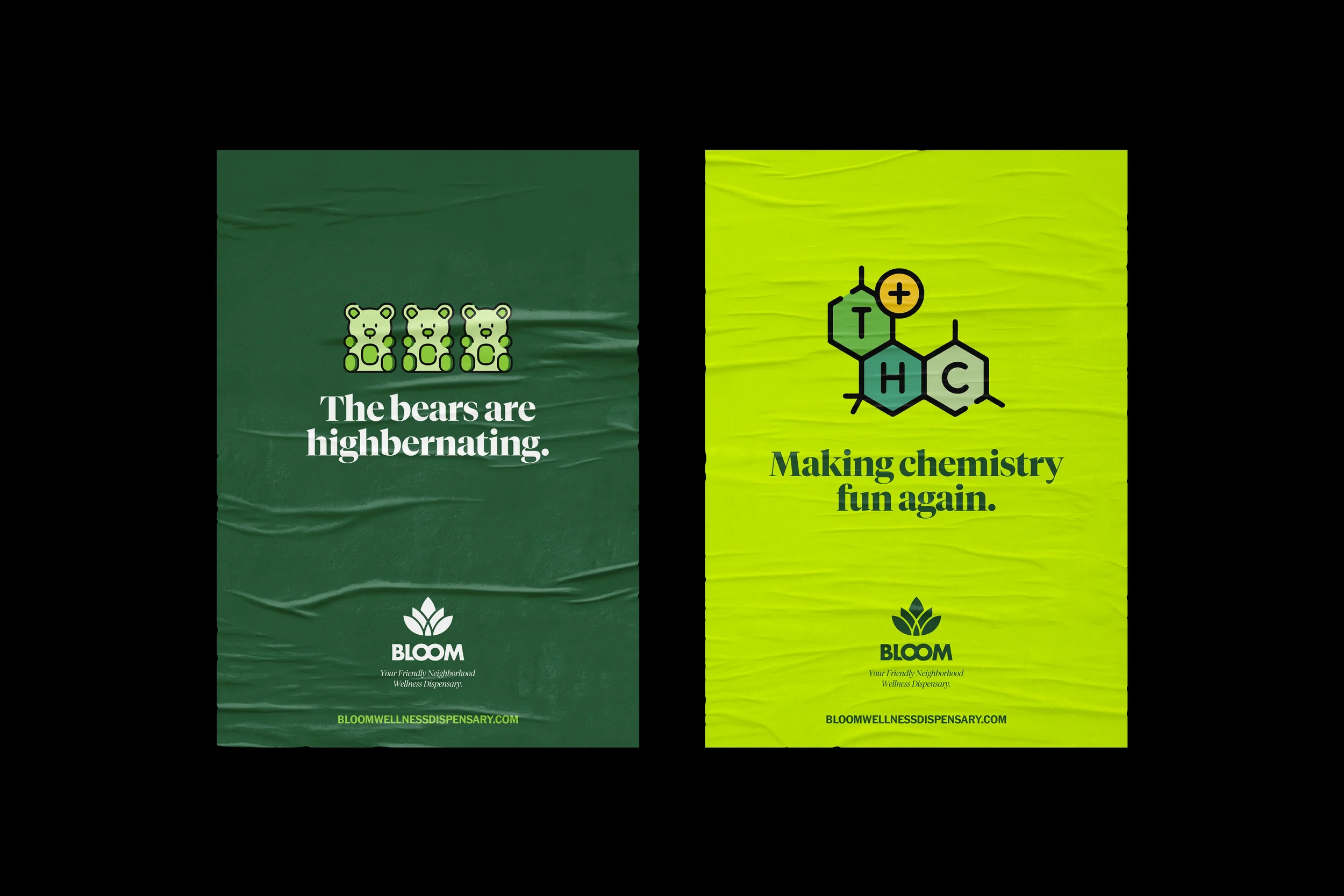
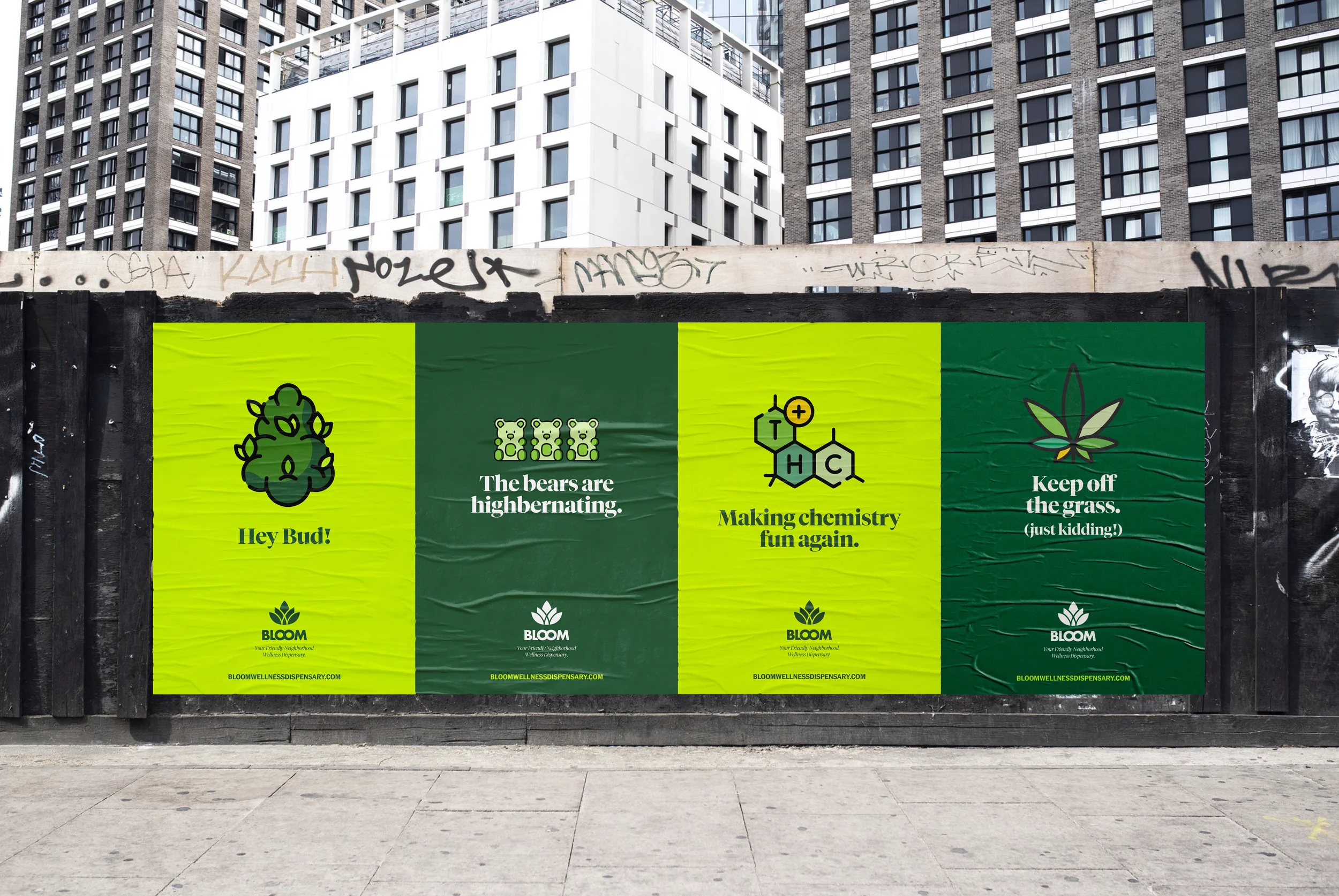
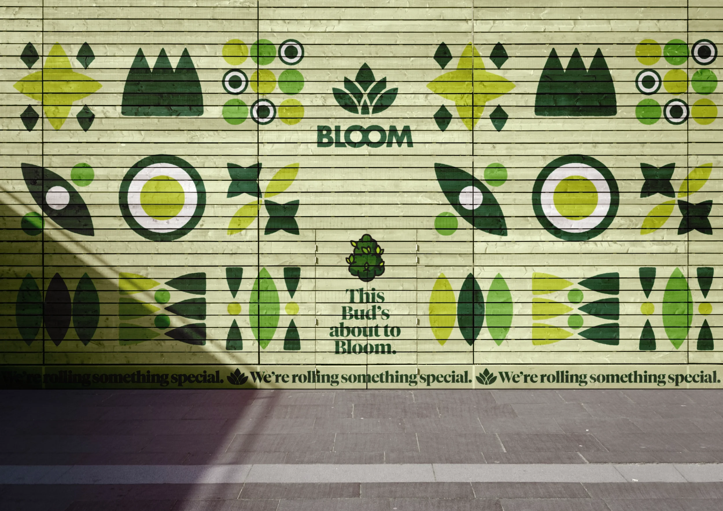
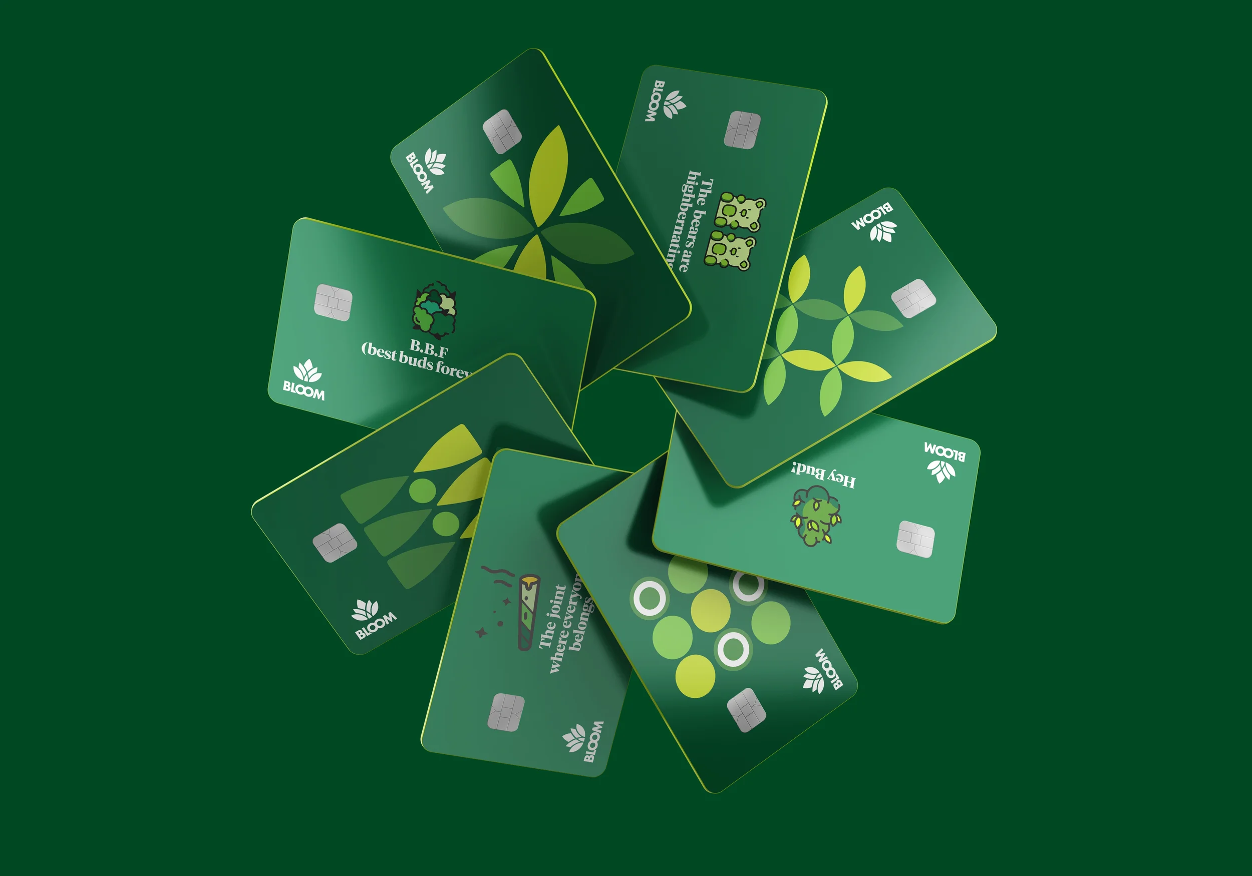
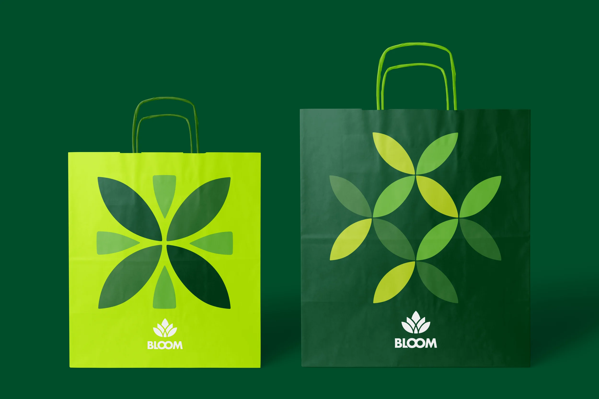
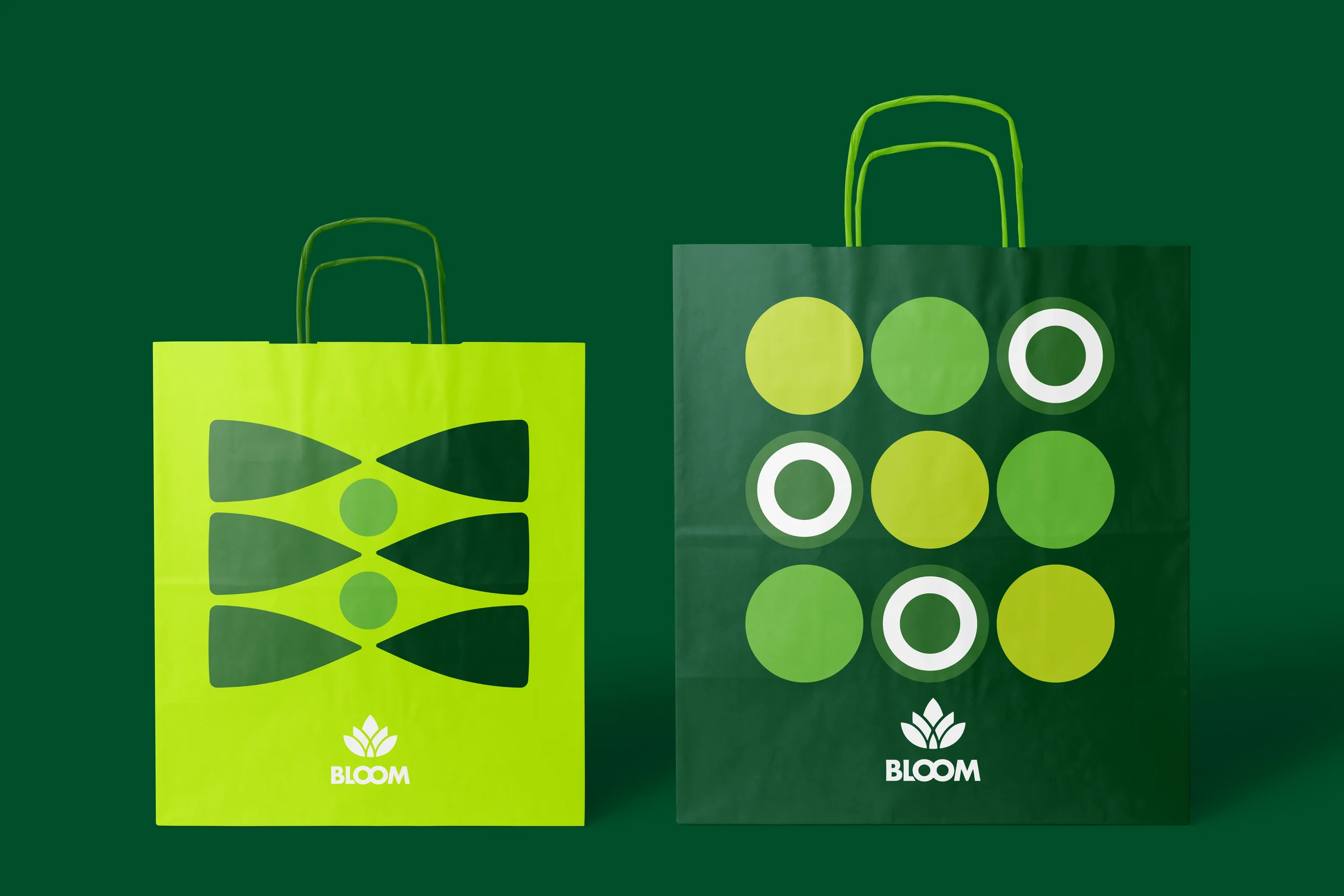
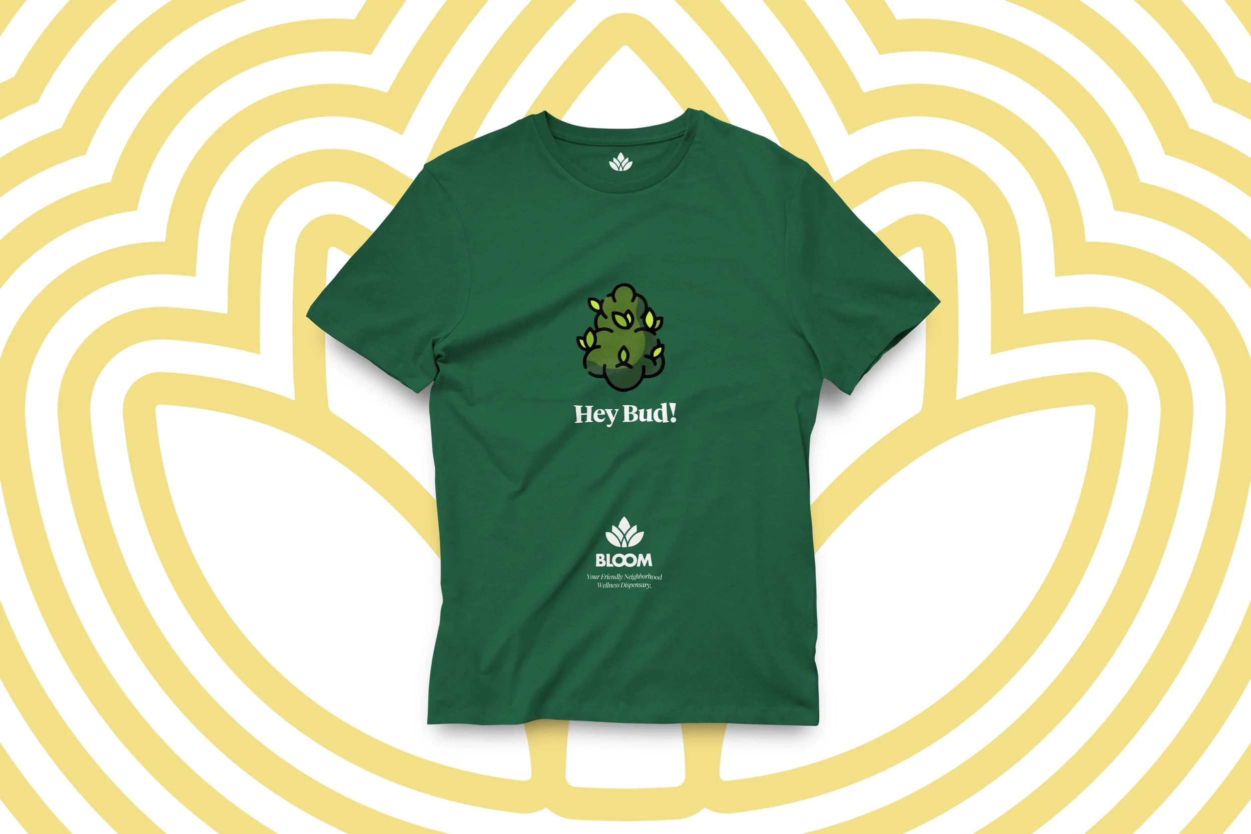
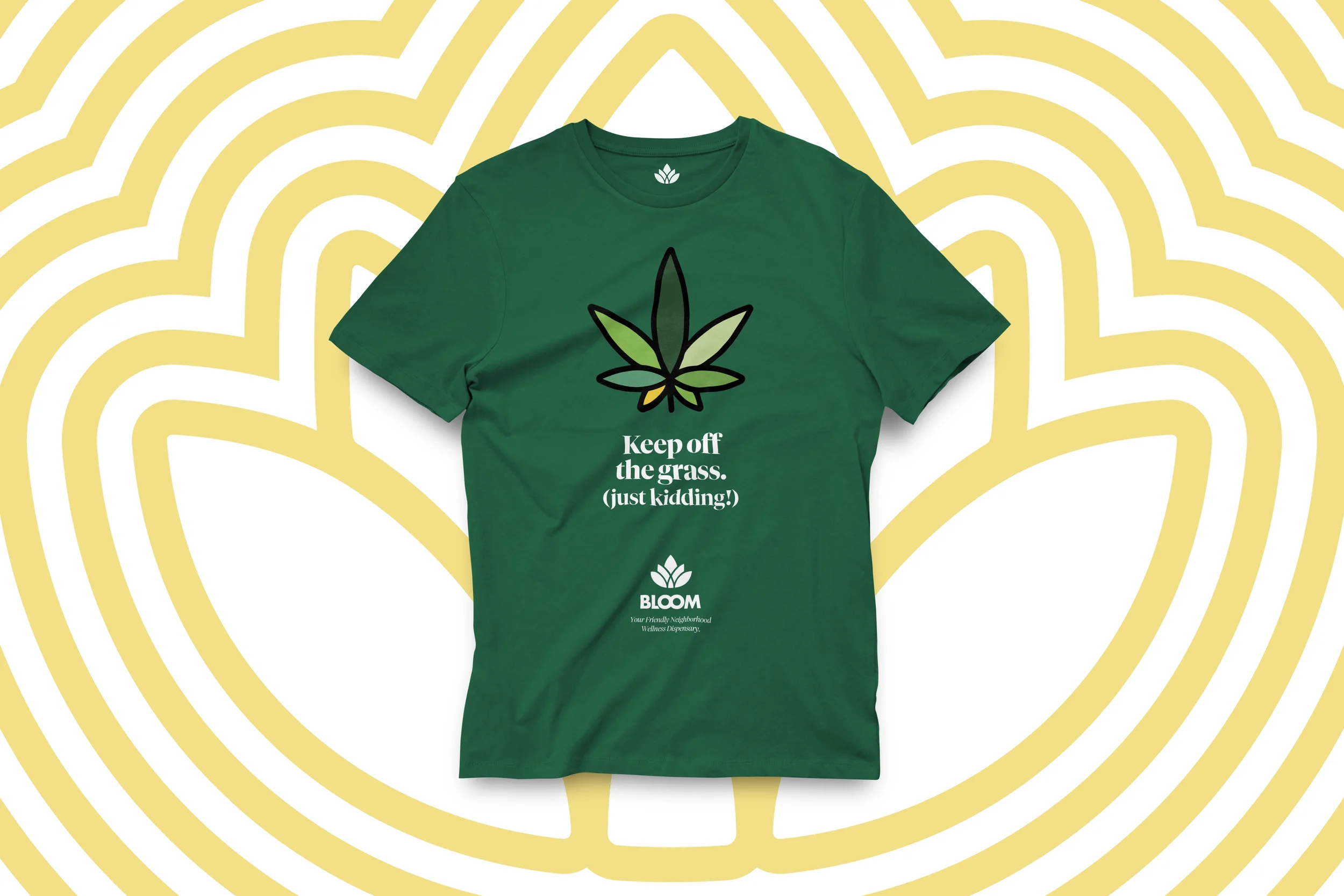
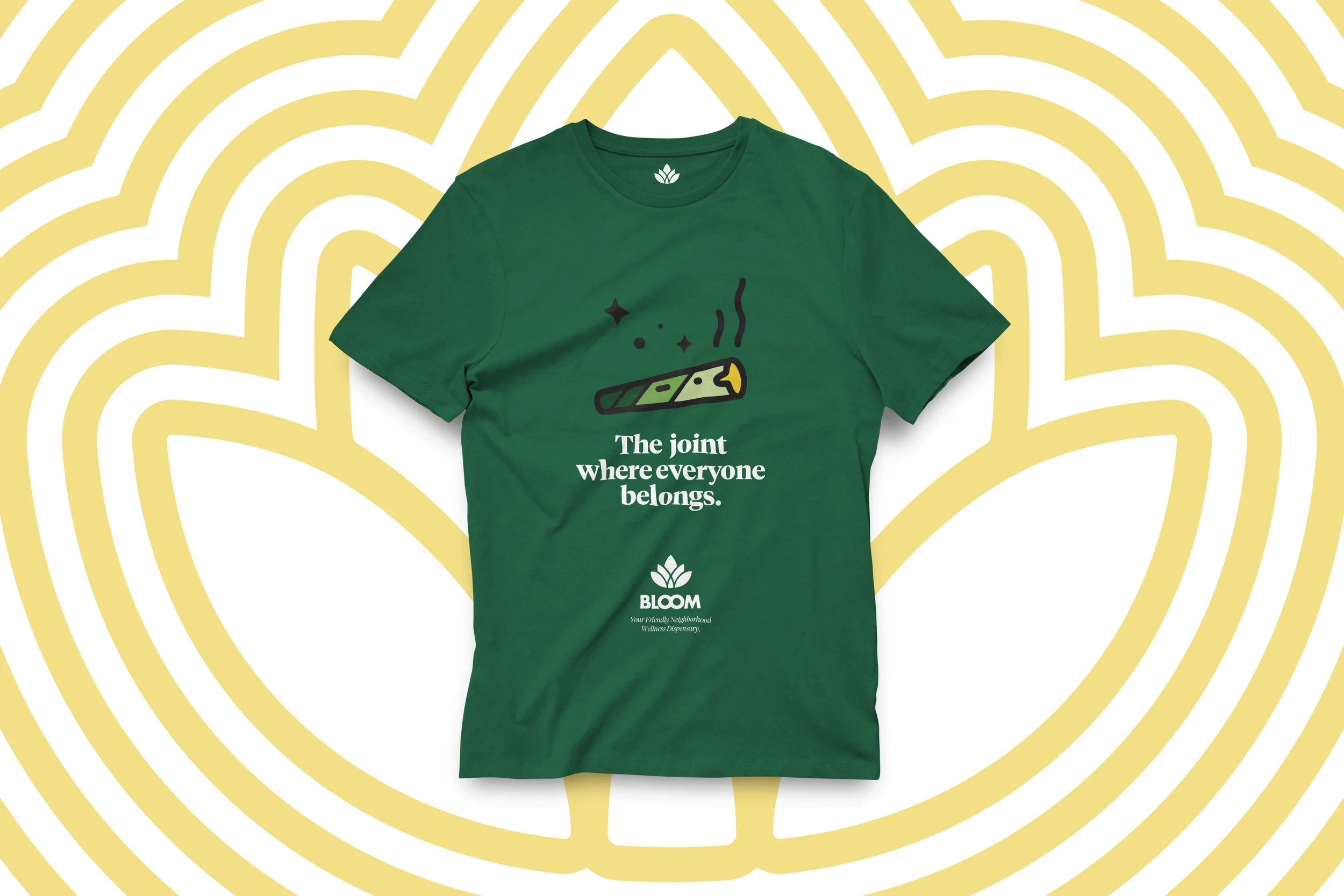
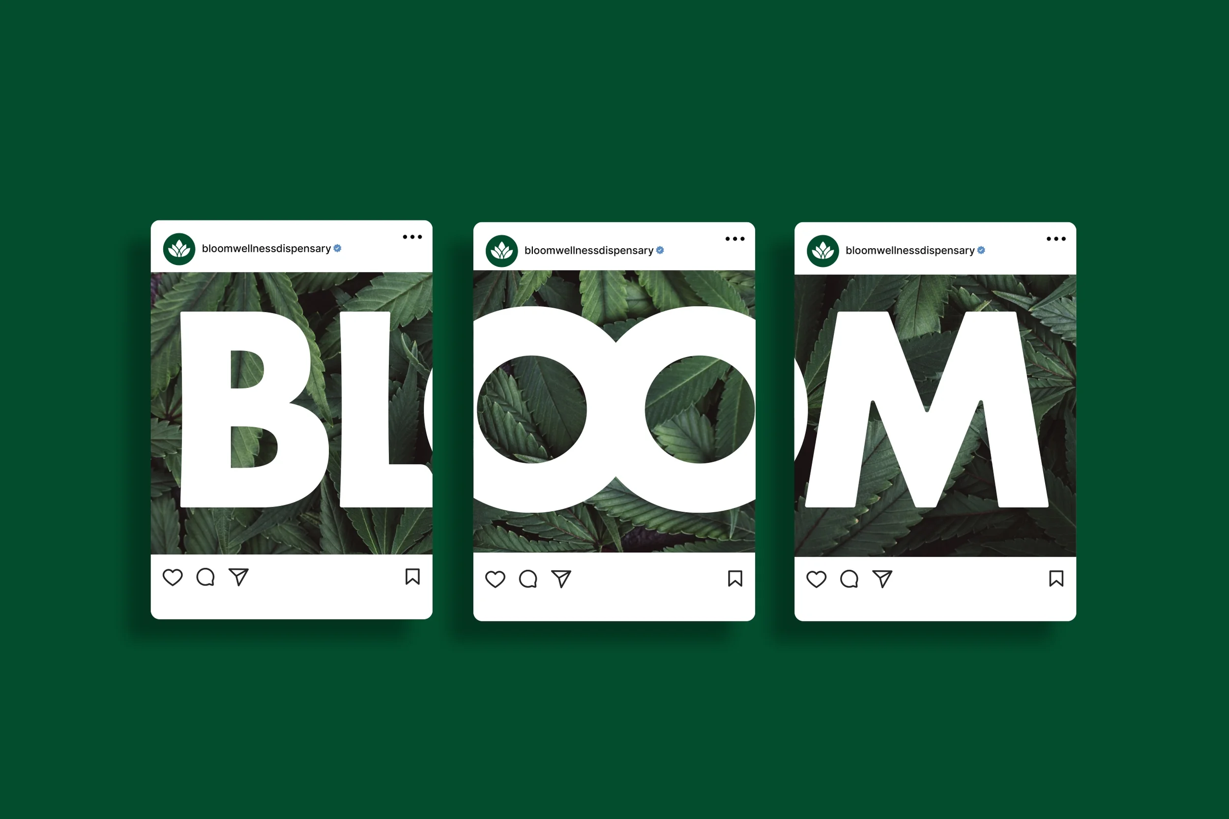
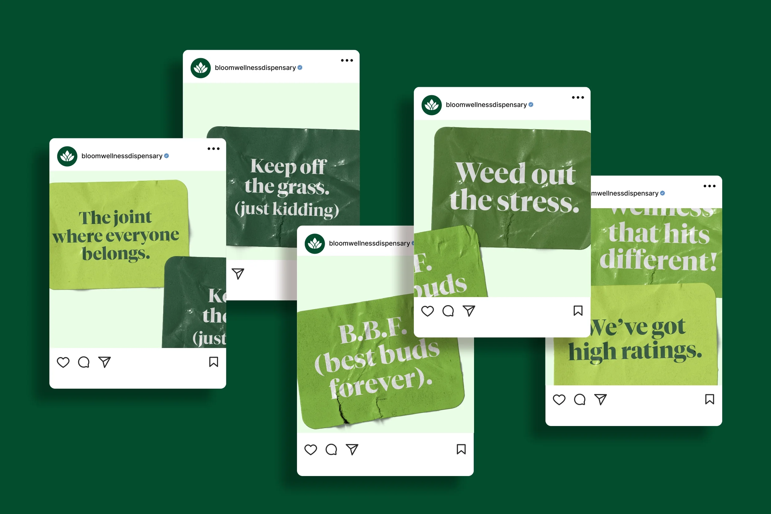
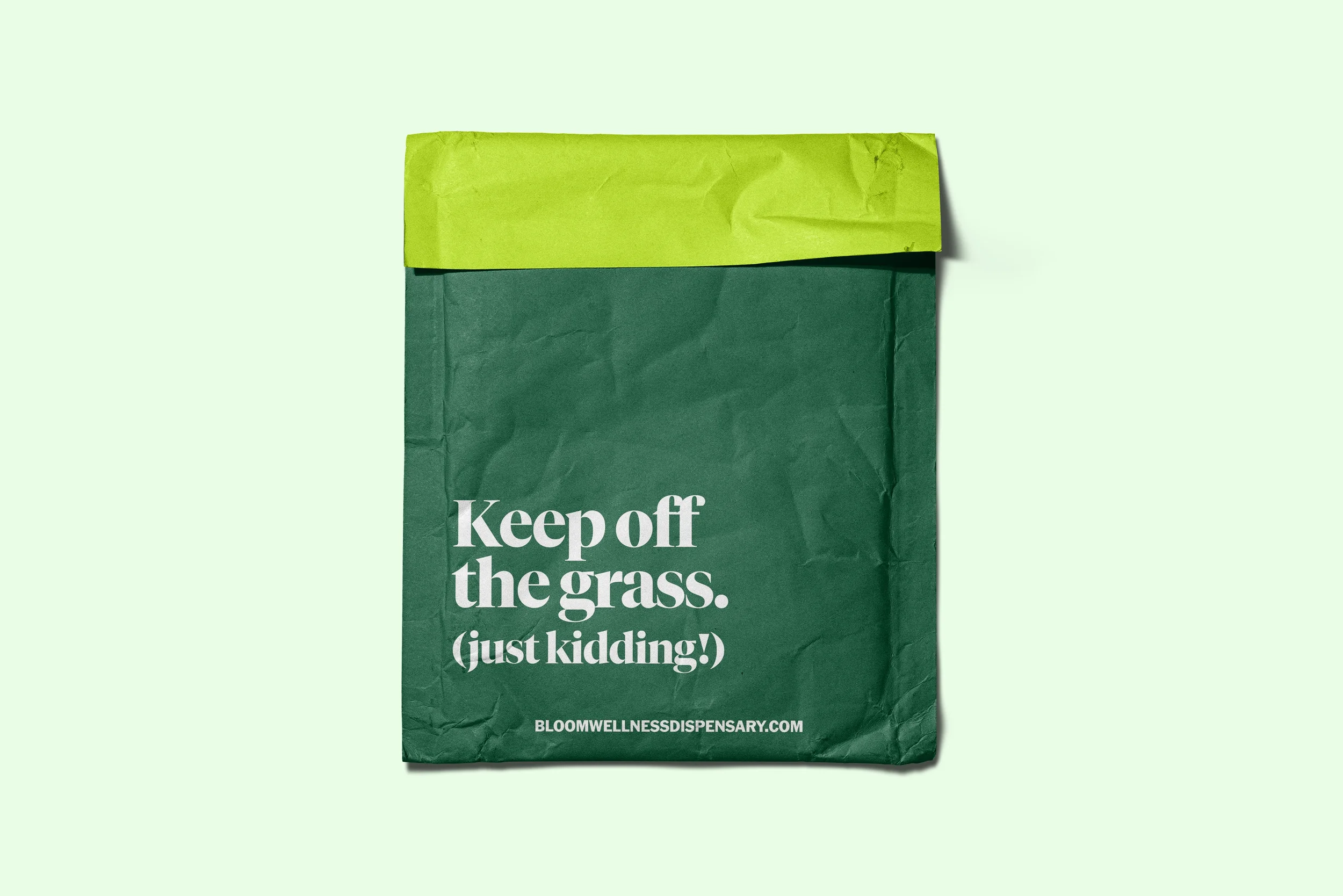
A chunky serif typeface, Tiempos Bold, gives the copy a bold editorial weight, and the custom icons — a rolled joint, a cannabis bud & leaf, gummy bears, a THC molecule — walk the line between approachable and clever. Bloom’s tagline, "Your Friendly Neighborhood Wellness Dispensary," says it all. This is a brand built for the curious first-timer and the seasoned regular alike — destigmatized, design-forward, and genuinely fun. It doesn't hide what it is. It celebrates it.